Context
Our team designed and built both the marketing site and purchase path for Camden’s Roundhouse, going through a full process of pre-discovery, discovery, wireframes, design, build and testing.
We used our own product Skyway to facilitate the purchase pathway.
This project took place over the span of two years, with the project being put on hold during the pandemic and later on to accommodate the development of a new brand.
Tasks
My role
I was the lead designer on this project. Working closely with a digital producer, I carried out user research, ran a number of virtual discovery sessions, developed a full set of wireframes and designs for both the marketing site and purchase pathway, and supported the project during its build.
My tasks
- Carrying out pre-discovery research such as an analytics review, HotJar analysis and journeys audit
- Leading a number of virtual discovery sessions with the client, including sessions on user personas, journeys, a card sort and content hierarchy session
- Setting up a tree test on Optimal Workshop and analysing the results
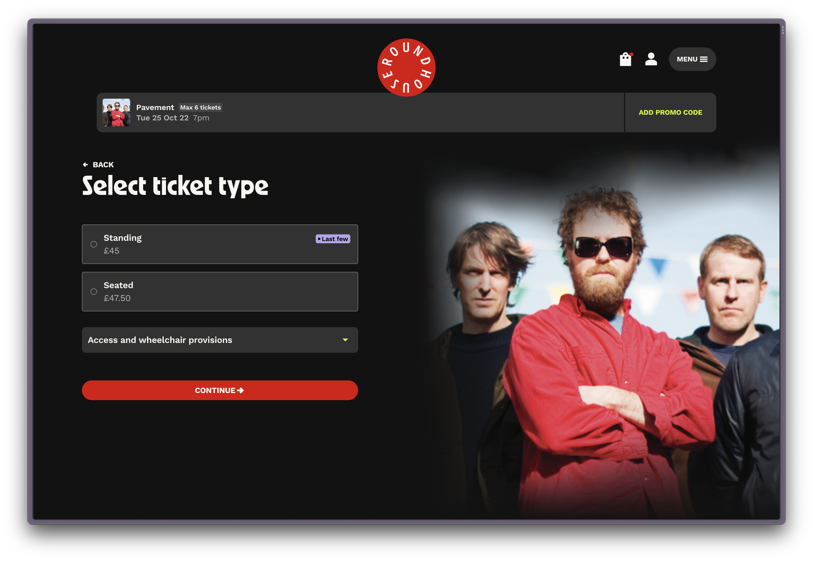
- Creating wires and designs for the marketing site and the purchase path, including buying tickets and memberships, room booking, class booking, and donation journeys.
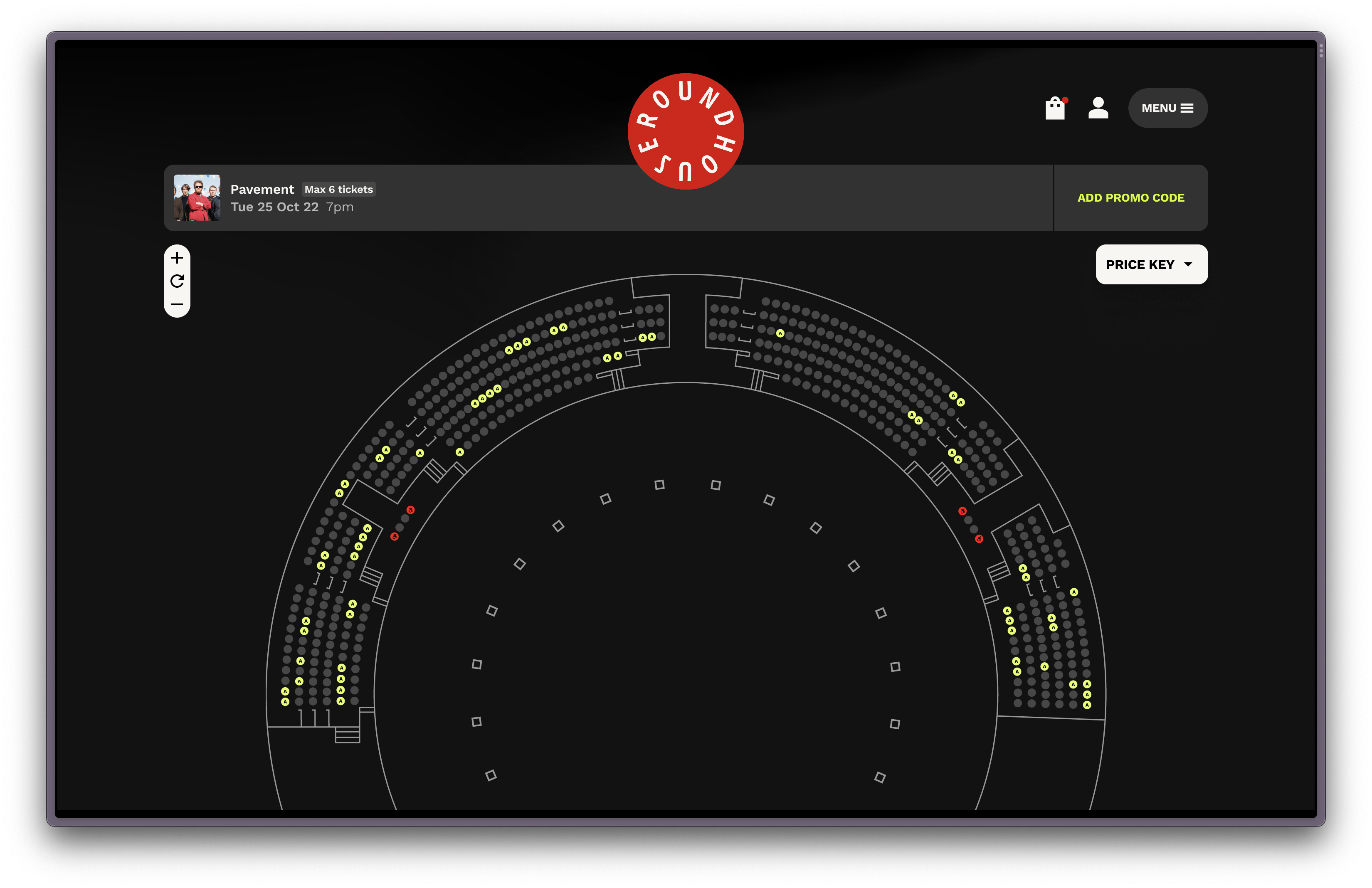
- Developing a set of seat map SVGs based on various seating layouts used by the Roundhouse
- Coordinating the team-wide testing effort of the marketing site and purchase path
- Completely overhauling our internal process for documenting and speccing designs by creating a developer-friendly database in Notion. Also made improvements to our internal testing approach by doing away with spreadsheets and setting up an organised Jira board. Both processes have since been adopted company-wide.
Challenges
Complex booking journeys
The Roundhouse has a large offering, from gigs and events to workshops and room bookings, all of which is facilitated via their ticketing CRM Tessitura. The customer-facing side of this is managed by our product Skyway, which we customised extensively to ensure a frictionless and accessible user experience.
Solution
We found that previously, users were often unsure whether they had selected the correct tickets with many events having a mix of standing (i.e. unreserved) and seated tickets available.
We tweaked Skyway’s booking pathway to make it easier to select the intended ticket type by creating a step in the journey which explicitly asked users if they were looking for standing or seated tickets. This would reduce user error and shorten standing journeys in particular, as those users would be able to avoid the seat map entirely.
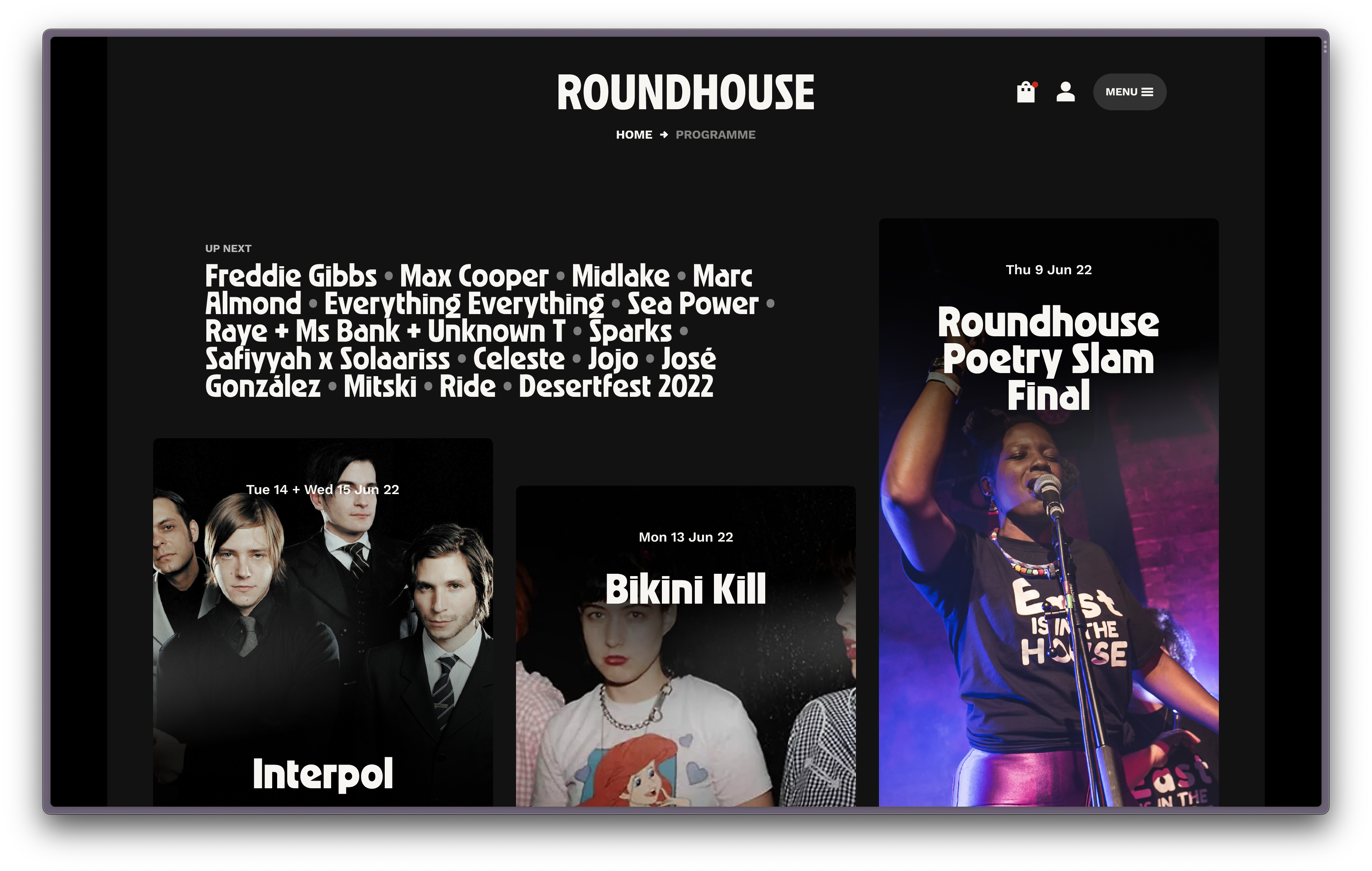
A fresh brand for the site & purchase path
Post-discovery, the Roundhouse decided to go ahead with a rebrand, which put the web project on hold for several months. Once the new brand had been developed, it was my task to apply and translate this to the designs, a major first application of the new brand and therefore an important milestone for the Roundhouse’s brand story as a whole.
Solution
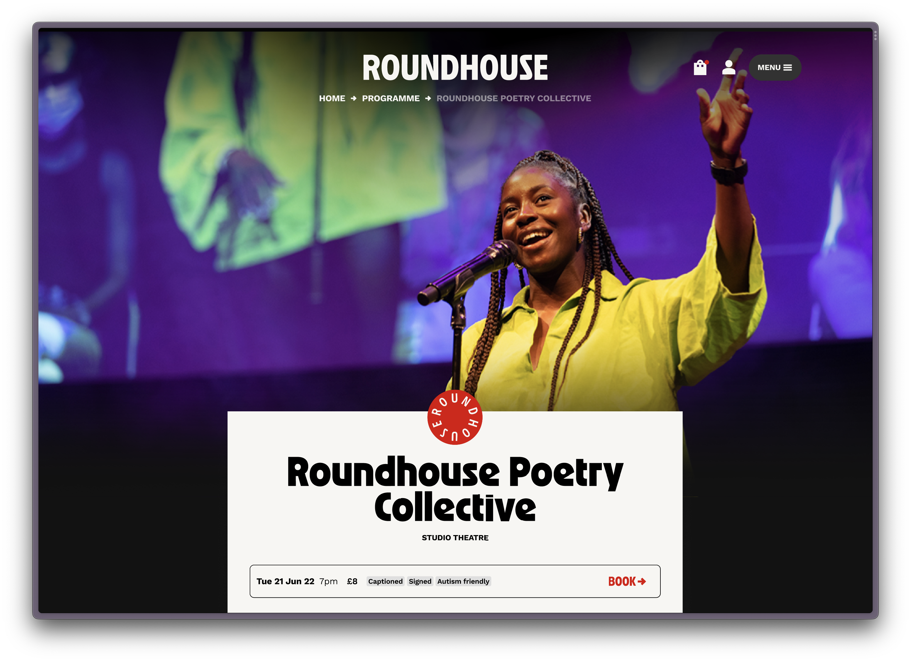
Roundhouse’s new brand concept Ignite (developed by Studio Moross) is centred around energy and passion, and being a creative trailblazer. I translated this to the web by creating a dark site, allowing copy and imagery to illuminate the site and bring it to life. In line with the new brand’s bold aesthetic, page layouts are centred, with hero imagery blending into the background for an immersive and dynamic feel.
Writing a spec for efficient hand off
Within the company, previous projects had adopted a range of approaches to creating a functional spec, though none had stood the test of time.
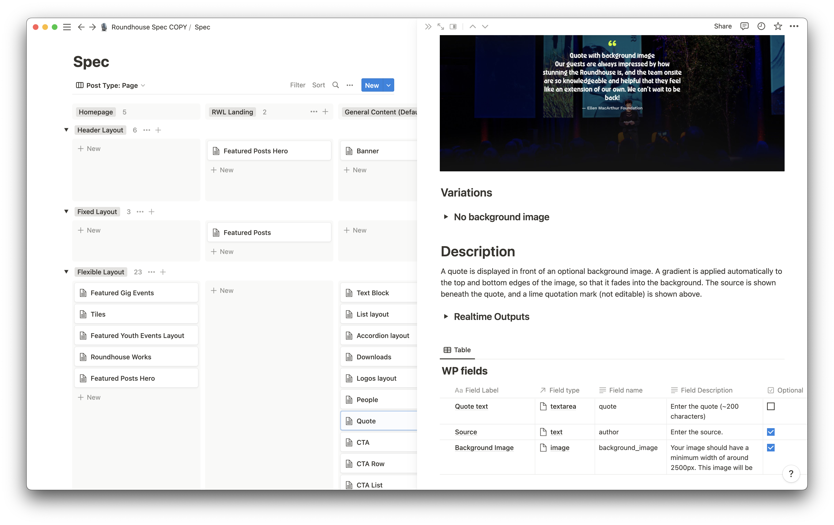
For this project, I set myself the challenge of creating a spec which would be used across both design and development teams, acting as the source of truth for each component’s design, functionality, interaction and CMS-editability. After surveying developers to identify what information they would find useful in a spec, I rethought and refined our existing approach, ultimately taking the spec from an unstructured Google Doc to a highly organised and cross-linked Notion database.
Solution
I modelled the Notion database against the new site’s fundamental architecture, creating a separate view for components which would be editable via the CMS. This allowed our back end developers to have an easy reference not just to what the designs looked like, but also how various components and templates should be set up. I took the opportunity to determine new field descriptions for the CMS while also adding a rough character count guidance, which would make the CMS more user friendly and require less training for the client’s staff.
The population and maintenance of the Notion spec was a cross-team effort, and I worked very closely with our back end and front end team to ensure everyone would be comfortable to take ownership and ensure everything stayed up to date throughout the project. The approach was well received and is now a firm part of our internal working.
Reflection
The Roundhouse is my biggest project to date and I am proud of its progress.
As design lead, I was able to take the initiative to drive forward a number of improvements to our internal processes, which were and are playing a large part in keeping the project running smoothly.
The site is live and can be viewed at roundhouse.org.uk